外环星域 原力16
水晶0
共和国币0 注册时间2010-12-9
最后登录2020-8-10
在线时间39 小时
外环星域 原力16
水晶0
|
本帖最后由 soloz_cn 于 2011-6-11 20:03 编辑
Working on the User Interface
打造UI
Hello everyone, my name is Michael Voigt, and I’m the Lead UI Artist here at BioWare Austin. In this blog, I’ll share some of our vision and goals for the user interface in Star Wars™: The Old Republic™ and the solutions that we used to achieve them.
大家好,我叫Michael Voigt,是B社奥斯丁的UI美工组长。在这段博客里,我想分享一些《旧共》UI的设计和目标,以及我们的一些现行方案。
The Original Vision
原始设计
During the early phases of prototyping we determined that we wanted a user interface that was more streamlined than most standard MMORPG interfaces. We wanted the user interface to neither detract from the world nor hinder the explorative nature of the game. We also felt that other MMORPG user interfaces were made up of a lot of complex shapes and very detailed outlines. We felt our silhouette needed to be sleek and simple and not add any extra complexity.
在原型设计的早期,我们决定将UI设计成比多数标准MMORPG的UI更加合理。我们希望UI不会让世界减色,也不会妨碍游戏的探索性质。我们觉得其它MMORPG的UI都是由复杂的形状和非常细化的轮廓组成的。我们认为我们的轮廓应该更加简单整洁,不需要增加不必要的复杂度。
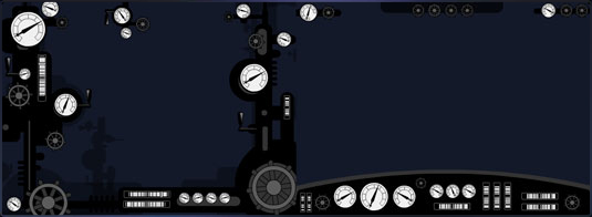
We used the analogy of the cockpit of a steam locomotive compared to a modern sports car. The locomotive had indicators and dials jumbled in all corners of the cockpit and the sports car had a sleek driver dash containing all the necessary indicators in an organized layout. This illustration shows the differences we were thinking about.
举个例子,我们使用蒸汽机车的驾驶室和现代跑车的来进行对比。蒸汽机车的驾驶室里遍布着各种指示器和刻度盘,而跑车只有一个整洁有序的包含必须的指示器的仪表盘。这个图例展示了我们所考虑的区别。
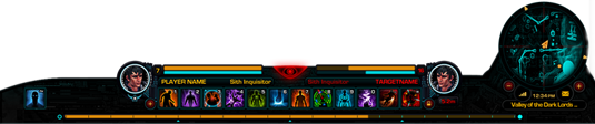
Interface Layout界面布局
Our game features beautiful scenic vistas and we wanted the user interface to complement those and not take away from them. The simplified sports car style silhouette gave a more letter-boxed effect and we felt this introduced less visual noise overall.
我们的游戏中有广阔的美景,我们希望UI能够对其进行补充而不是为其减色。精干的跑车风格的轮廓提供了更加“邮箱”化的效果。我们希望这样能够减少整体的视觉扰乱。
As we gradually worked to solve the complexity of the user interface, we had to ensure that the player was always provided with clear game indicators and controls. It was also critical not to alienate the seasoned MMORPG player. MMORPG standards are well established, and we did not want to stray far from those; players expect to have the ability buttons mapped close to associated keys, for example.
当我们逐步地解决UI的复杂性时,我们必须确保能够一直为玩家提供明确的游戏指示器和控制器。让MMORPG的老玩家们不被疏远也是极为重要的事情。MMORPG的标准已经建立得相当充分了,我们也不想过于远离这些标准,例如玩家会希望技能键列能够被安排在相近的键位上。
We analyzed each system and determined which areas could use improvement that wouldn’t confuse seasoned players and would also be intuitive for new players. Our goal was to introduce a familiar MMORPG interface that was less intimidating and innovative, all at the same time.
我们分析了这个系统,并决定了哪些部分可以进行改进既不会影响到老玩家也能够让新玩家觉得一目了然。我们的目标是提供一个通俗的MMORPG界面,既不过分吓人也不过分创新。
The Logical Grouping of Systems
系统的合理分类
As the different controls for various game systems came together we took the time to develop a logical layout for these. We took the canvas of the screen and broke that out into corners of the screen. The controls felt right pressed into these corners so as not to obscure the center combat area of the screen. Much like the controls of a sports car do not cover the view of the road, our game controls do not cover the combat/explorative portion of the game world.
基于许多游戏系统的不同控键,我们花了心血设计出了一个合理的布局。我们将屏幕作为一块画布,然后将其分为许多角落。控键会被压缩进这些角落中,不至于影响在屏幕中央的战斗区域。就像跑车的控制器不会挡住观察道路的视线一样,我们的游戏控键也不会挡住游戏世界中的战斗/探险部分。
Interface Layout图面布局
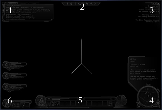
We came up with the following structure which you can see above in diagram form:
以下这些组成部分你可以在上图中找到对应的位置:
1. Social Systems: Chat - Top left 左上:社交系统—聊天窗
2. Game Systems : Help - Top Center 中上:游戏系统—帮助
3. Mission Systems: Top Right 右上:任务系统
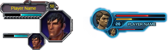
4. Navigation Systems (World Indicators) - Bottom Right 右下:导航系统(世界地图)
5. Combat Systems: Experience (Player Indicators) - Bottom Center 中下:战斗系统—经验(人物指示器)
6. Party Systems: Companion - Center-to-Bottom left 左下:团队系统—队友
After putting together this basic structure, we developed screen mock-ups. These were variations of different style treatments, with some mimicking real-world materials and some being more abstract. This provided a good basis to ensure we had a strong candidate to continue work on.
将这些基本组成部分结合在一起后,我们设计了屏幕样图。有许多种不同风格的方案,有些是仿自现实世界中的材料,有些就更加抽象。它们提供了很好的基础,保证我们有优秀的备选方案继续工作。


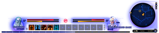

Screen Mock-ups屏幕样图
The strongest was selected and further iterated on. While we were iterating, we returned to our core concerns – that players of all experience levels would be able to easily use the interface. We also decided the final UI candidate needed to be streamlined, sleek and complementary to our worlds.
我们选择了最优秀的一个继续进行改进。在改进中,我们回归到核心问题——所有程度的玩家都应该能够很容易地使用这个界面。我们同时决定最终的UI备选方案需要更加合理、整洁,并且能为我们的世界增色。
Then we took some time to look at our framing, in other words how the UI elements work around the action of the game. We noticed that the trend in game interface framing seemed to be that frames were becoming more minimalistic. For example, if you look at some of BioWare’s earliest games, often the game interface is quite large with quite a bit of framing.
之后我们花了一些时间来审视我们的框架设计,换句话说,在游戏运行时UI各部分是如何运作的。我们意识到游戏界面的框架设计似乎有越来越卡通化的趋势。例如,当你回顾B社的一些早期游戏时,多数游戏界面都相当大,有着相当多的框架。
We analyzed this further and noticed that screen resolution had a lot to do with this thread. Today’s graphic cards and monitors can output and display much higher resolution imagery than the VGA monitors and single-chip graphics cards of old. Older games had to have much larger framing elements to ensure text was a legible size. By contrast, we also had to be careful because screen resolution has gotten so high that text can be made too small to be legible. In The Old Republic players will be able to set their text-size preference, but we wanted an extremely usable default experience.
我们进一步进行了分析,并发觉按这个思路可以在屏幕分辨率做许多文章。现在的显卡和显示器可以输出比老式的VAG显示器和单芯片显卡更高分辨率的图像。早期的游戏需要更大的框架部分以确保文字足够清晰。相比之下,我们也十分小心,因为屏幕分辨率已经如此之高,文字可能会变得过小而无法辨认。在《旧共》中玩家能够设置他们偏爱的文字大小,但我们希望能有一个非常好的默认体验。
Increased Text Density增加了文字密度
With all of these considerations in mind, we decided to make further refinements to reduce the amount of framing on-screen. We wanted to utilize almost all of the interface’s screen space for indicators and controls, leaving only the necessary amount of framing.
整合了所有这些问题,我们决定进行进一步提炼以减少屏幕上的框架数量。我们希望尽可能地完全利用起界面的屏幕空间放置指示器和控键,只留下必须的框架数量。
When this stage was completed, I actually felt that we held on to some framing for aesthetic purposes that could have even been further reduced - but we still had time to iterate, so more on that later.
这个阶段完成之后,我其实觉得我们保留的基于美观目的的框架甚至可以进一步删减——但我们还有时间进行重制,所以以后我们会继续这项工作。
With framing work complete for now, we took a pass at lessening the density of information and the overall ‘heaviness’ of the user interface. We found that reducing the amount of text was a great way to achieve this. Where possible, we found methods to symbolize text with icons. We trimmed the always-on text to be only the essential pieces. The overall outcome was an interface that didn’t appear overly cluttered.
现在框架部分的工作已经完成了,我们接着进行降低信息密度和整体UI“沉重感”的工作。我们发现减少文字量是完成目标的极好方式。只要可行,我们就会使用图标来代表文字。我们将一直出现的文字修整成只保留基本的部分。最终的结果是显示的界面不再杂乱无章。
Implementation
制作
At this stage, much of our work was pure design, but with this framework in place we started the implementation of the user interface in-game. Working always with our original vision in mind, we brought each of the interfaces for our game systems online one by one.
在这个阶段,我们的许多工作都是纯设计,不过按照这个框架的设计我们开始游戏内的UI。在工作时我们一直将原有设想放在心上,一个接一个地将每一个游戏系统的界面制作完成。
Various Systems各种系统
With so many game systems in The Old Republic, the implementation phase was quite extensive. Most of our game systems involve quite a bit of interface interaction, and can also be quite varied, but our team of extremely talented interface developers really carried this implementation. They turned our vision into in-game reality. It was quite exciting for my team to watch them work their magic and see our designs come to life, system by system.
《旧共》中有如此之多的系统,制作阶段就相当的长了。我们多数的游戏系统都包含了大量的界面互动,但我们团队里这些极具才华的界面设计师们还是完成了制作工作。他们将我们的设想变成了游戏中的现实。当我的团队看着他们展示出他们的魔法将我们界面设计中的系统一个接一个地变成现,实在是太让我们激动了。
While it’s extremely gratifying to have my team’s vision seen in the game, The Old Republic is continuously undergoing feedback testing, both internally and externally. During implementation we were always reacting to feedback from everyone and improving the quality of the interface. We certainly see this as a process that will continue through launch and beyond.
当我们兴高采烈地在游戏中看到我们的设想时,《旧共》正不断接受内部和外部的反馈测试。在制作时我们一直需要按大家的反馈进行返工,提高界面的质量。我们清楚的知道这个过程将会持续到正式发行之后。
Aesthetics
美工
After the core systems were in-place, we took a deeper look at our aesthetics and decided to ‘tighten up the graphics’. We wanted to further raise the bar and really up the ante on our overall interface quality.
当核心系统都就位之后,我们深入观察了我们的美工设计,并决定“紧紧抓住画面”。我们希望能够更上一层楼,提高我们整个界面的质量。

Evolving Style演变风格
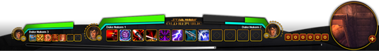
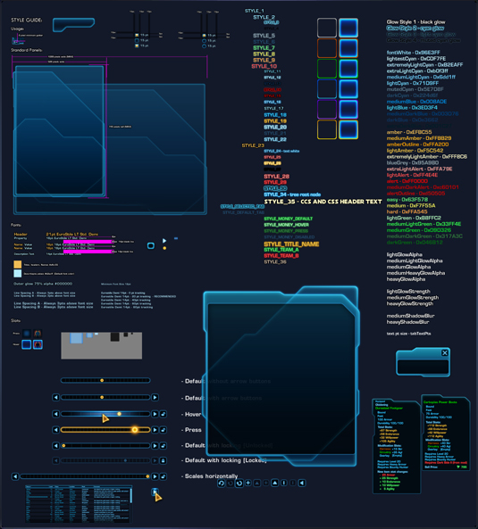
To achieve this, we invoked the power of our concept artists to take our existing vision and increase the visual fidelity. Having a pass focused solely on visual qualities was essential to unifying coloration, theme and overall consistency. As you can see from this style guide, we worked hard to ensure consistency!
为了达到这个目标,我们调集了概念美工来们已有的设想并提高视觉保真度。在一段时间内完全聚焦于视效质量对于统一着色、主题、和整体一致性来说必不可少。就像你在这个风格指南中所能看到的,我们努力在确保一致性!
A Unified Theme统一的主题
As mentioned before, even after working on our framing, I felt that we still had a bit of excess framing. The interface still wasn’t as minimal as it needed to be. However, during this aesthetic pass, I feel we trimmed the fat and completed our solid visual direction.
就如之前所提到的,即使在我们完成了框架设计之后,我仍觉得还有多余的框架。界面仍然没有达到最小需求量。不过在美工设计阶段,我觉得我们成功地减了肥,最终完成了我们的视觉导向。
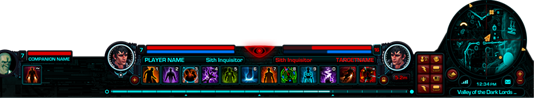
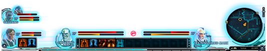
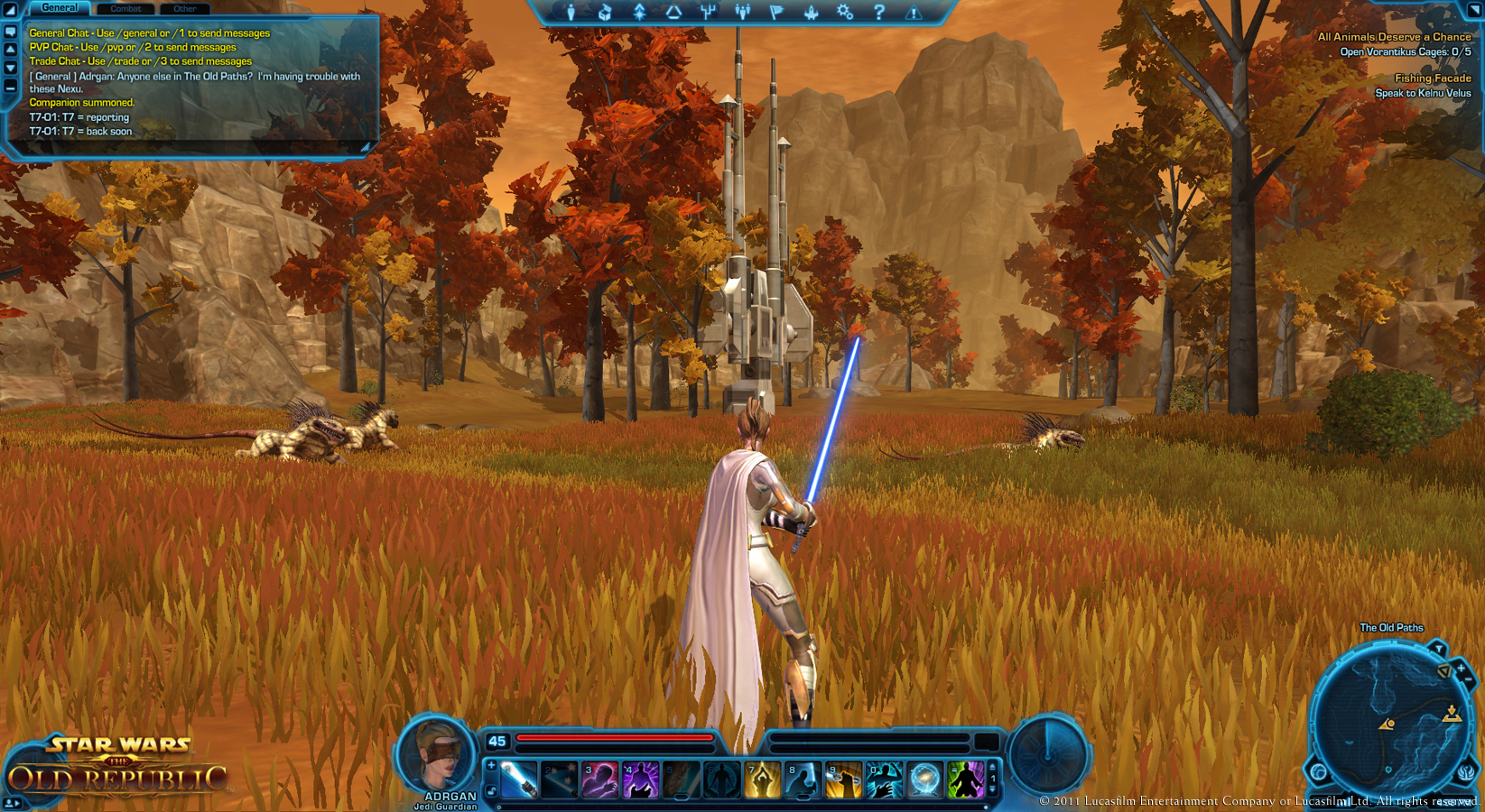
This pass also allowed us to capture some elements that were neglected along the way and give them the proper attention needed to ensure our high quality level. Right now, this image is representative of the current interface in The Old Republic.
这段时间也让我们找出了一些之前被我们忽略的元素,并且对它们投入了所需的适当精力来确保我们有很高的质量水平。现在,这张图片展示了当前《旧共》的界面。
Evolving Style演变风格
Our user interface has changed quite a bit within the ever-changing games market environment. I feel we are well on our way to achieving all of our goals and we will continue to analyze the market, observe feedback and continue to improve until ship and beyond.
我们的UI在千变万化的游戏市场环境中已经有了相当大的改变。我觉得在通往我们的目标的道路上还算顺利,而我们会继续分析市场,听取反馈,并在游戏发布及之后继续改进。
I greatly enjoyed sharing this information with you and look forward to feedback and comments when you get to play The Old Republic!
能与你们分享这些信息十分快乐,期待在你们玩上《旧共》之后能够给我反馈和评价!
Michael Voigt
Lead UI Artist
UI美工组长 |
|


 发表于 2011-6-11 19:43